Storytelling and Vitra Campus
Our brains are fond of the stories and the metaphors used while we’re creating them. Unlike transmissions based on pure rational data, information is processed in a more efficient way in this type of editing. The reason depends on the condition that whether our emotions are triggered by narrator/ information server. The emotions which are aroused through stories connect rapidly with our personal experiences. In this process, almost each realm of the brain starts to take action and the moment we live in turns into one full of emotion. Thus, incidents stay in our memory longer compared to the neutral moments. Actually this situation metaphorically resembles putting a chemical stamp on a particular set of information where it’s written “attention”.
All these enormous and marvelous transactions which reside at the background of brain’s storytelling come into a practical existence as a personal experience while strolling around the Vitra Campus. As the guide mentions about the architectural stories, the experience in hand suddenly becomes substantially colorful; even though the iconic architectures of the campus never cease to amaze. Along with the stories and fictions behind each structure, you’re becoming a part of the design process of the architect or the designer even for a short amount of time. While the sensual input of the information cited by the guide -image, sound, texture, color, user feelings- triggers one apiece emotion in the brain, it succeeds to involve the visitor as part of the architecture.
Schaudepot
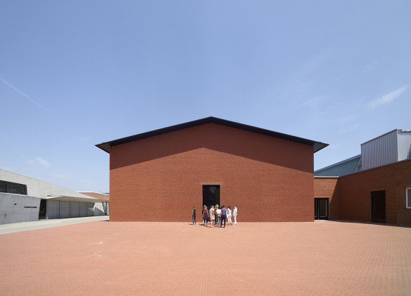
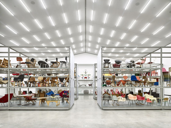
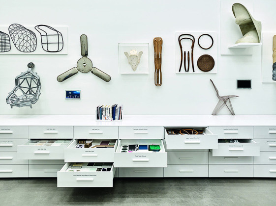
The first place where it makes the visitor question the perception of museum and its approaches appears to be ‘’Schaudepot’’ (projection store) in the Vitra Campus. The structure, wherein a furniture collection of seven thousand pieces is displayed, hosts the permanent collection of the Vitra Design Museum. The first interaction with the building starts with a query of describing the additional building as a museum or exhibit hall. The building looks like an outcome of the hybridization of museums and exhibition areas; despite the fact that it is described as a projection room. Because the building enables the exhibition of a permanent collection of 400 pieces from the 1800s, ranging from furniture including the works of Le Corbusier, Charles & Ray Eames and Alvar Aalto, to products made with relatively new technology three-dimensional printers, in the form of an exhibition hall.
In this way, the architecture detaches the history-reading over objects from the museum fiction which we are accustomed to, and works on it through a scenario that mixes a warehouse and an exhibition hall.
At first glance, the building resembles a fairly simple house with no window, a triangular roof and single yard. The gigantic flat face and symmetrical roof of the architecture are made up of thousands of unbroken clinker bricks and this approach adds bizarre warmth to the building. This instinctive intimacy reaches a higher level when the guide begins to talk about the story of the architecture. He mentions that all the bricks are broken and shaped by hand, and the creator of this work, Herzog & de Meuron, is inspired by the local houses of the region. At this point, the mind suddenly begins to imagine other houses of the region and animates the designing process of the building. This mental process grows stronger by the plainness of the building which is purified from powerful and distracting elements. This attitude of simplicity stands so powerful that it seems the architecture is not designed to manifest itself or prioritize its contents. It, solely, comes into existence and feels like it will continue to exist for a long time with its powerful silence. This effect is further strengthened by the continuity of the floor which holds the same texture, color and material as the building. It shapes a sense of eternity and disappearance both horizontally and vertically.
Inside the place, all the aroused emotions on the outer front of the structure create a completely opposite effect of anticipation. The humble simplicity encountered outside meets the visitor with artificial white lighting which may come glamorous and even exhausting this time. It’s like the feeling of simplicity on the outside has designed reversely as a visual bombardment when inside. The place consists of a main hall, collection, periodical exhibit rooms, museum café and a museum shop. The main hallway divides the place sharply into two mutual areas. Starting with the museum shop, the circulation setup continues with the side-by-side exhibition of iconic objects of furniture design history. This area of the place corresponds to one of the questions that occupy my mind on my each personal museum visit. Architecture and setup of the museum seem to be whispering the answer to how the exhibited works must be placed together and how museum architectures should be positioned in this fiction in terms of roles and priorities. The architecture in many museums steals so much of the show due to their magnificent structure so that the works of arts turn into mere architectural factors. However; the structures and the works, here at Schaudepot, are in harmony together without stealing roles from each other; one may question whether it’s due to simplicity of the architecture or the iconic features of the exhibited furniture.
Fire Station
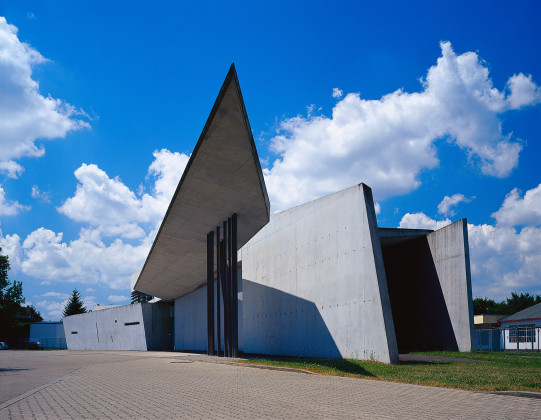
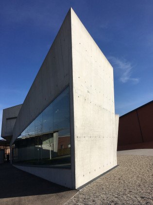
The fire station stands across the Schaudepot, at the opposite direction of its architectural simplicity. While the fact that its architecture is the-first-applied-work of Zaha Hadid makes the building interesting enough, geometry of the building makes contribution as well. The architecture creates its own dynamism with triangle and sharp forms. The building features the dynamism of an-always-equipped creature that would instantly jump off the ground and move forward. The guide talks about the story of Zaha Hadid’s gorgeous architecture while telling, with a smile, the evaluation of it from the perspective of a firefighter. This ensures the richness of the background story of architecture through inclusion of narrator’s own experiences and emotions in storytelling. It’s kind of like the architecture rebuilds its own story at each visit or use. The idea/story that is plucked from the architect’s mind is reproduced every time by each individual in the room. In other mimics, in other smells, in other voices, in other touches, in other times, it gains new bodies over and over again.
The building was constructed after a fire at Vitra Campus in 1981 which caused a serious damage in the area. For the construction of the center, the area from the main entrance to the Museum of Chair is selected and the architecture is designed to form an edge of this 500 meter long section. The program of the building also includes surrounding walls, a bicycle park and some small objects. The architecture, with its intersecting units and the synergy of gross concrete and glass, stands in fact far-beyond the familiar forms of Zaha Hadid. The fire station makes the visitor feel the need to approach from a different angle beyond the applied design decisions. The building, within its context, takes part in the production center triangle which is built by Schaudepot and SANAA architecture. Unlike the consumer-centered approach of the two architectures, the fire station seems to endure mainly for visual feast. Because the building neither contains the solutions of the functional comforts of the firefighters nor provides enough space for fire trucks. So it turns into a museum in time. This situation, actually, reminds that the architectures in the Vitra Campus are not solely separated by visual style but have contrasts with functional approaches.
Conference Room
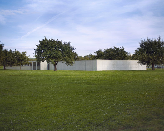
The silence of visitors while moving through the path designed to lead to the Conference Room is in some way honoring the architecture. Design of the pathway which enables one to pass easily but is too narrow for two people creates an instinctual silence. At this point, the guide cites that Tadao Ando designed this place in order to give workers space and time to focus on, like a meditation place, while going towards the conference room. He tells that it’s designed in a way to let them clear their minds without speaking until the meeting building. Even this information leads to substantial increase of respect to the architect, human, structure and environment; the effect of it peaks when first encountered with the building. The strong silence of gross concrete and glass combination creates a quite impressive appearance. Co-existence of the daylight and selected materials in particular, and configuration of this whole composition by the maestro of Japanese minimalism make an enormous glory for the visitor. This whole impressive harmony evokes a quote by Tadao Ando; ‘‘I don't believe architecture has to speak too much. It should remain silent and let nature in the guise of sunlight and wind’’.
The architecture is generally located on a flat surface and one part of the place-space-descriptions is resolved under the ground. When examined at large, the building consists of three main constructs; the square courtyard located in the pit, a rectangular volume placed at an angle of 60 degrees, and a volume of cylinder connecting these two rectangular volumes. It hosts the conference room which leads to the courtyard all located in the pit, the library, private rooms and a lobby. The fact that route to the entrance of the architecture passes through skirts of the wall has a striking attitude for the first encounter. While it prompts to contemplate due to being isolated from distracting environmental factors, it also creates a quite unusual claustrophobic sense. At the same time, as the building adds its silent attitude to this stunning effect, the accumulation of emotions expands. An opening that can be considered as narrow in the architecture is defined as an entrance. The building seems to be making a narrow and somewhat long entry because it does not want to allow one or the other to leak in or out. This intermediate space between the described exterior and interior is quite impressive. At the end of this intermediate space which is formed by relatively dark, narrow gross concrete; a long glass panel door is encountered. The choice of a transparent material kind of assumes the task of softening a sharp transition between interior and exterior.
The use of sharp lighting within the place takes on an important task in space description. The impact which derives from the dark status of the intermediate place changes in reverse direction when entered into the place. Inside, it seems like a place filled up with daylight, darkness and deep feelings. Here, the hand drawings of the place along with the iconic furniture, where you can meet anywhere in the Vitra Campus, take part. Afterwards, it is passed through a half-moon balcony overlooking a large courtyard, and then to the big meeting room. Jasper Morrison-signed tables and iconic chairs of Eames are used at this place. Among the stories told by the guide regarding the background of architectural details, a cherry tree which faces the backyard of this conference room appears to be the one that affects me the most. It is indicated that Tadao Ando agreed upon this architectural contract when provided that the sakura tree was not cut off. This information takes out the architecture from its known parameters and moves it to a totally different level. Suddenly, the idea that walls are between columns is being diverted away, and an interior sensation which encompasses the tree standing across has a say. Because when looked through the large glass panels of the conference room, it’s seen that the nature is framed in a cheerful way. This framework, which gives the impression of looking at a painting rather than a real landscape, further enhances the meditative effect of the place. Wooden panel doors used throughout the architecture and light-colored wood material used on the floors downstairs reduce substantially the coldness of gross concrete and glass panels. The light in the places dominates in such a natural way, that it makes you feel like being in a place in the nature, where it’s formed naturally. The light is leaking through the well-designed gaps. This, I think, increases this sense of naturalness in serious amounts. It further strengthens the conscious modesty that the building has been worn by other constructs around it.
The meaning and context of the expositions represented at the Vitra Campus, the editing of the iconic architectural places, the method of interaction with visitors are rather different compared to other museums. Places here are such as to change comparatively the conventional museum setup. The context in which structures are designed and the storytelling inside of the architectural experience make this interesting setup stick in one’s mind. The stories referred by the guide enable to portray each point of the experience-at-hand more vividly. It also allows me as a visitor to somehow become a part of the architectural experience, in which I’m a participant. It feels that you’re taking part in the narration with each architectural story. My mind seems to associate buildings and prepare a cognitive map as if each structure is connected to each other with invisible strings.
Related Content:
-

Prix Versailles Unveils World's Most Beautiful Museums List for 2024
-

İşbank Painting Sculpture Museum
-

MUMO: The Innovative Museum Truck
-

La Vetrina dell’Ingegno
-

Contrasting Ceramics - Princessehof
-

Quake Museum
-

Wall, Hall, Dust & Rust
-
The Elephant in the Gallery
Melis Uğurlu commentates on her unique experience of Elephant West, a gallery that relieves visitors from the fatigue of white cubes
 17.03.2017


